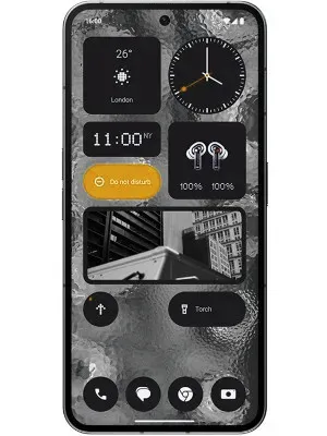
othing 2a: Redefining Mid-Range Brilliance
Elevating Expectations with Seamless Performance and Innovative Design

Introducing the Nothing Phone 2a: Illuminating Mid-Range Expectations
With much anticipation, the successor to the debut device from Nothing has finally emerged, though its arrival has been more of a quiet murmur than a resounding roar. While the original Nothing Phone turned heads with its transparent design and unique Glyph Interface, the 2a takes a more understated approach, emphasizing affordability and practicality. But does it manage to strike the right chord, or does it fall short of its predecessor’s brilliance?
Affordability with a Competitive Edge?
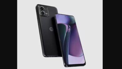
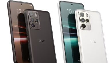
Priced at a speculated ₹23,999 in India, the 2a comfortably positions itself in the mid-range market, going head-to-head with established contenders like Xiaomi and OnePlus. While its price tag is undeniably enticing, it faces tough competition from alternatives like the Redmi Note 13 Pro Max, which offer comparable specifications or even better features at a similar price point, potentially putting the 2a at a disadvantage.
Specifications: Unveiling the Hidden Potential?
On paper, the 2a boasts respectable specifications. Powered by the Mediatek Dimensity 7200 Pro chipset, it promises smooth performance, complemented by dual 50MP cameras and a 120Hz display catering to everyday needs. However, doubts linger regarding its real-world performance and camera capabilities compared to rivals with similar hardware.
The Glowing Query: Illuminating Functionality or Mere Gimmickry?
The distinctive Glyph Interface, featuring LED lights on the rear panel for notifications, remains a standout feature. Yet, its practical utility is subject to scrutiny. While visually striking, its impact on usability and battery life raises questions, leaving consumers to ponder if it adds genuine value or merely serves as a flashy distraction.
Verdict: Patience is Key
The Nothing Phone 2a presents an enticing price proposition and respectable specifications, but it faces stiff competition within the crowded mid-range segment. While the Glyph Interface adds a unique touch, its practicality remains unproven. Therefore, exercising patience and awaiting comprehensive reviews and comparisons before making a decision may be the prudent course of action to determine if the 2a truly shines or merely flickers in the smartphone landscape.
Additional Considerations:
The design of the phone may not capture attention as effectively as its predecessor.
Concerns persist regarding battery life, particularly with the Glyph Interface in operation.
The longevity of software support and updates could significantly impact the device’s overall appeal and usability.
This assessment aims to provide a well-rounded perspective on the Nothing Phone 2a. Remember, the true measure of any smartphone lies in its day-to-day user experience, making informed decisions based on thorough evaluations and user feedback imperative.


